> ## Documentation Index
> Fetch the complete documentation index at: https://support.snowie.ai/llms.txt
> Use this file to discover all available pages before exploring further.
# Performance Metrics
> Analyze call volume, agent efficiency, and geographic data.
## Analytics Overview
The **Analytics Dashboard** provides a holistic view of your AI workforce. Use this data to optimize spend, improve script performance, and identify high-traffic regions.
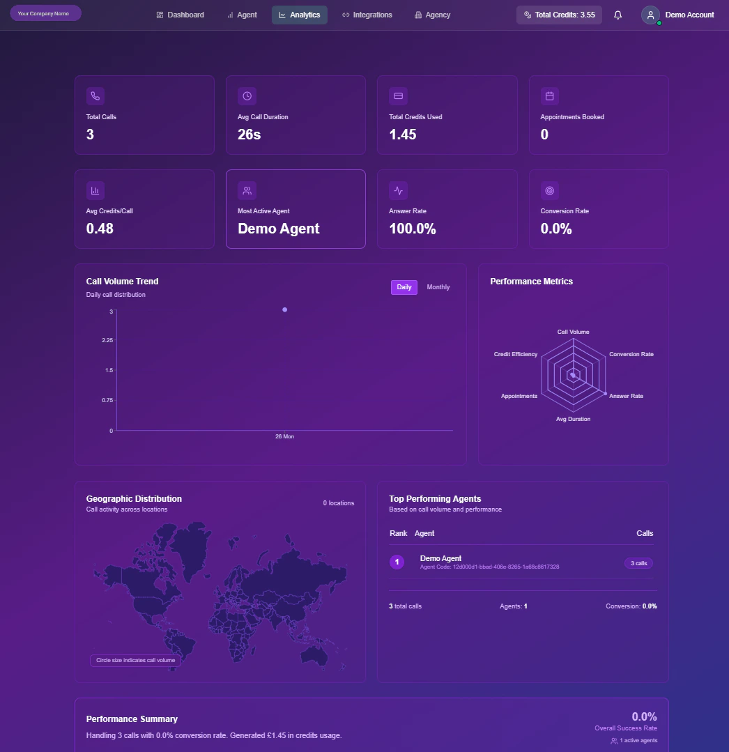 ## Key Performance Indicators (KPIs)
The top ribbon of your dashboard displays 8 critical health metrics. These are updated in real-time as calls process.
Aggregate count of inbound & outbound sessions.
Mean length of conversations (e.g., 1m 42s).
Cumulative cost incurred for the period.
Total successful bookings confirmed.
Average credit burn rate per interaction.
The specific bot handling the most volume.
% of outbound calls picked up by humans.
Success rate for defined goals (e.g., Sales).
***
## Visual Intelligence
Beyond raw numbers, Snowie visualizes trends to help you spot patterns.
### 1. Volume & Trends
**Chart Type:** Line Graph\
This graph plots call volume over time. Use the toggle to switch between `Daily` (tactical view) and `Monthly` (strategic view) to spot peak traffic hours or seasonal spikes.
### 2. Efficiency Radar
**Chart Type:** Radar / Spider Web\
A multi-variable comparison of your overall efficiency. It balances four competing metrics:
* **Credit Efficiency:** Are you spending wisely?
* **Call Volume:** Are you scaling?
* **Conversion Rate:** Are calls successful?
* **Answer Rate:** Is your data quality good?
### 3. Geographic Heatmap
**Chart Type:** World Map\
Visualizes the physical location of your leads. Larger "bubbles" indicate higher call density in that region, helping you localize prompts or acquire local phone numbers.
### 4. Agent Leaderboard
**Chart Type:** Horizontal Bar\
A ranking of your agents (e.g., "Sales Bot" vs. "Support Bot") by total workload. Use this to identify which agent configurations are being utilized the most.
## Key Performance Indicators (KPIs)
The top ribbon of your dashboard displays 8 critical health metrics. These are updated in real-time as calls process.
Aggregate count of inbound & outbound sessions.
Mean length of conversations (e.g., 1m 42s).
Cumulative cost incurred for the period.
Total successful bookings confirmed.
Average credit burn rate per interaction.
The specific bot handling the most volume.
% of outbound calls picked up by humans.
Success rate for defined goals (e.g., Sales).
***
## Visual Intelligence
Beyond raw numbers, Snowie visualizes trends to help you spot patterns.
### 1. Volume & Trends
**Chart Type:** Line Graph\
This graph plots call volume over time. Use the toggle to switch between `Daily` (tactical view) and `Monthly` (strategic view) to spot peak traffic hours or seasonal spikes.
### 2. Efficiency Radar
**Chart Type:** Radar / Spider Web\
A multi-variable comparison of your overall efficiency. It balances four competing metrics:
* **Credit Efficiency:** Are you spending wisely?
* **Call Volume:** Are you scaling?
* **Conversion Rate:** Are calls successful?
* **Answer Rate:** Is your data quality good?
### 3. Geographic Heatmap
**Chart Type:** World Map\
Visualizes the physical location of your leads. Larger "bubbles" indicate higher call density in that region, helping you localize prompts or acquire local phone numbers.
### 4. Agent Leaderboard
**Chart Type:** Horizontal Bar\
A ranking of your agents (e.g., "Sales Bot" vs. "Support Bot") by total workload. Use this to identify which agent configurations are being utilized the most.